Recruiting brand refresh raises a new flag

Recruiting brand refresh raises a new flag
BRAND
Bright Flag
SCOPE
Visual identity design
Verbal identity system
Website design and content
CONTEXT
Launched in 2018 to provide specialized recruiting services to transportation industry contractors, Bright Flag’s rapid growth led to acquisition, expanded offerings, and new opportunities for the brand to evolve from its bootstrapped beginnings.
Rather than repositioning the brand in a dramatic way, Referent streamlined Bright Flag’s name, messaging, and visual identity to amplify what had made it successful to begin with.

Before

Project overview
01 Brand messaging
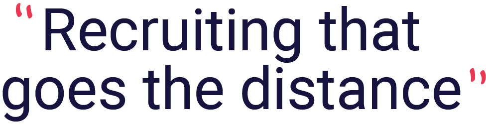
Streamlining the name & message
Bright Flag originally launched as “Bright Flag Recruiting.” As the brand’s recognition grew, we recommended dropping “Recruiting” from the name and using it in supporting messaging instead.
We also wrote a message strategy for Bright Flag that built on the effective strategy already used by the brand while providing an overarching structure, flow, and style to the brand’s communications.


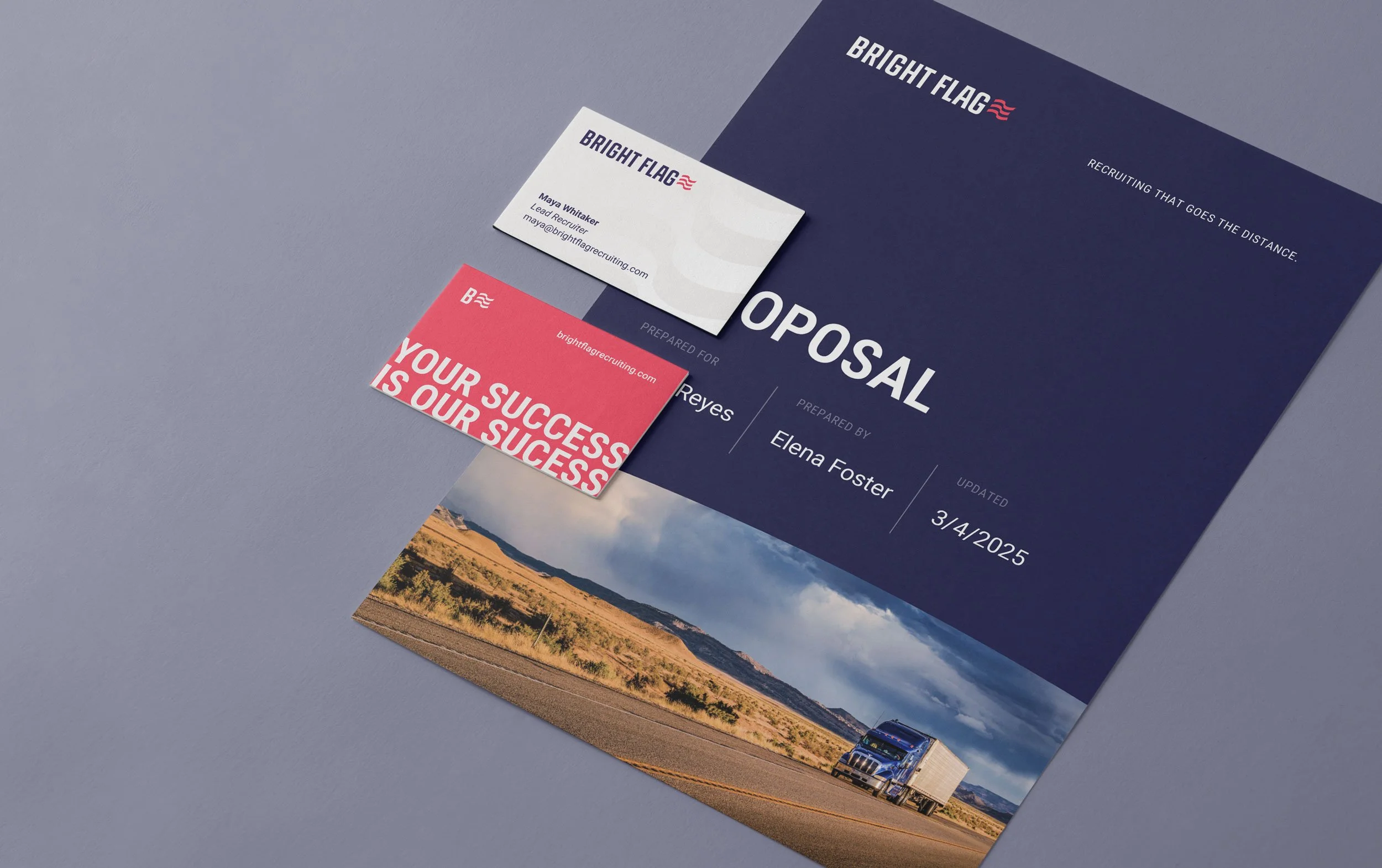
03 Brand redesign

More legible, memorable, flexible
The redesign of Bright Flag’s brand retained the key identifiers the brand already had equity in: compressed typography, a waving flag, and a navy / red color scheme.
However, careful updates to the logo significantly improved flexibility across digital touch points, especially at smaller scales. The simpler lockup is more recognizable at a glance, and the customized typography adds subtle character while improving legibility.


05 Website design
We completely reimagined Bright Flag’s website, while retaining selected content that already connected with their target. Through a process of information architecture, content writing, and UX / UI design, Referent transformed Bright Flag’s online presence from “small business” to “industry leader,” reflecting the firm’s rapid growth and true capabilities.
Before
After